So anoter week has gone by and i have made some improvements over my last few posts - though i'm only going to show some of them. I inked and added detail to my storyboards (mostly spacial depth stuff so you get a sense of things), inked and colored the "Front View" of my Red Mage design, inked the Back View, and made sketches for my "Set".
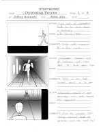
Page 1: I don't know how well this is going to work out, but i'm gonna try it anyway. Recently they've been showing episodes of Teen Titans on CN and Boomerang, and i love some of the styles they use to show certain things; like when they have a duel or someone running a long distance or something, they'll have the bottome half of the screen be completely black (to illustrate the ground the they're running on and force the subject into the middle of the screen without getting so close). That's what i'm going to try and do in some of the panels/shots of this animation (Spec. Panels 1 & 6-9)
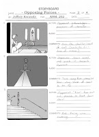
Page 2: Not much has changed besides the gradients added in Photoshop. Same stuff as the pencil version.
Page 3: I decided what was going to happen in Panel 7, and it can happen quite a few ways too...though essentially they are all the same. The character can throw is sword "Blade-over-Hilt" and catch it with just a vertical jump before landing/striking
downward -
or - the character can throw it "Sideways" and catch it with a "jump-and-a-spin" before striking
sideways. I would personally like to see the sideways one because the stance/pose he'd be left in would be more dynamic......but the blade over hilt would be easier to animate overall.
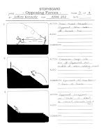
Page 4: So this is essentially what the animation is going to be, though if it looks like it'll be longer than 30 seconds i have ideas of whta actions to cut/simplify/overlap. But either way, after the semester is done, depending on how well i picked up on the 'animating' principles and process, i'm definitely planning to make a longer verson of this idea...with more action and fighting than right before Demi Moore left Bruce for Ashton.
So the details of the overall scene are somewhat lacking in the storyboards, so i decided to make a preliminary sketch to plot out the key points before i go in to model it (though usually i can sit down with nothing in my head and after a few hours come out with something awesome).
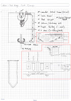
It might be hard to tell what way the stairs are going and what is a new level and such, but i should have some rought renders and models in a week or two, so don't fret if it's hard to read.
It's mostly just the basic outline of everything, once i actually go into maya and start modeling, things might change to look more 'organic' or natural....so the set probably won't look like this 100%...but it'll look relatively similar.
Side Profile of the main room of the 'set'.
Mostly what all is in this is just basic geometry and lighting elements, trying to say that the lights should only illuminate from tapestry to tapestry....so there will be black patches every so many feet (to try and accomplish a certain effect for the first shot of my storyboard).

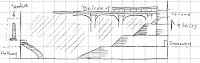
 Here's a rough 3D mock of how i imagined 2 parts of the city being - the Merchant & Guild Quarters (though 'quarters' might be switched out by something else depending on the kind of vocabulary i choose to use in the world). Merchant Quarters are where most shops and bazaars and such are, where as the Guild Quarters are where guilds and things of that sort are located (a lot of quests originate here).
 This is just another angle of the work thus far...closer up just so you can get a feel for the size of the dividing inner-city walls and the larger outer wall. Its all just quick concepts and such right now...so a bit of this might change (or just get greater detail).
 Here's a quick mock i made of archives before working on the town layout - just setting out basic shapes to get a general feel for what may or may not work in the long run. Size/details will definitely change as i realized some of what's in the picture won't really work in the end...but the overall 'feel' will kind of be the same.
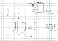


.jpg)


