
 So this is the concept i came up with for the wall that goes around the main/initial town in my story (it would be the equivalent to Traverse or Twilight Town from Kingdom Hearts I/II). I was heavily influenced by the Great Walls of Ba Sing Se (from Avatar: The Last Airbender), but there were a few times where the wall just seemed...funny and whimsicle because of how it rose/fell and weaved along the mountain crest.
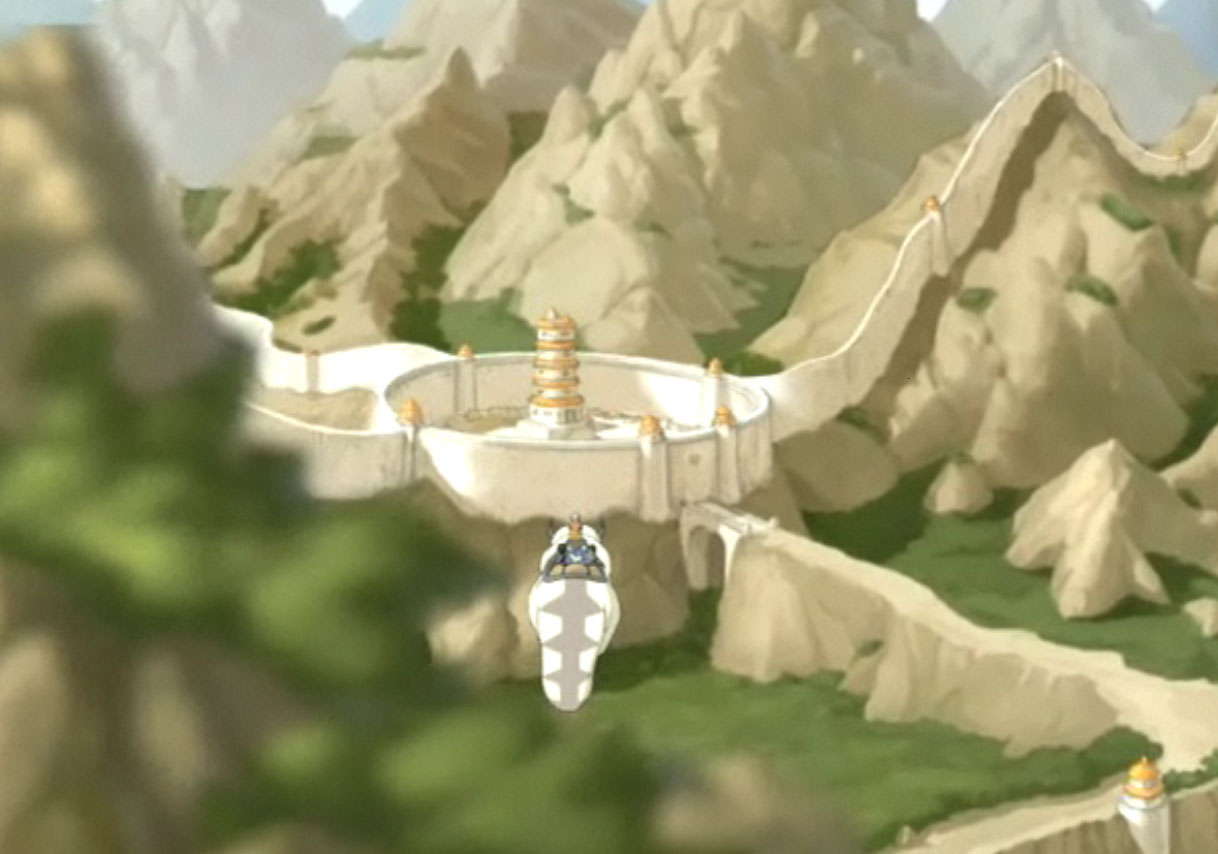 I can understand why a wall built like this would have an ever-changing 'levelness', but since there's elemental manipulation in my story, i don't want to be limited to "real world" mechanics...which is kind of why i find some of these pictures i captured so funny.
 This is a pretty good kind of "middle ground" between the rise/fall of the terrain and the levelness of the wall. Again, i wanted mine to be a constant height, so this would only partially represent my idea.
 This is the kind of...aesthetic i'm going for in my wall design - grand, towering, impenetrable, almost as if it weren't man-made. I mean, the ground at the base of the wall isn't 100% level, but they maintain a constant height all around the inner-city. There's far less terrain near the city of Ba Sing Se than in my story, but the constant height thing is almost a must for me.
 This was a concept sketch i came up with for for my main town (after the post below this one, but before my design for the wall) and it might not make much sense to the viewer without any insight into my story/worl, but i'll eventually have some 3D mock-ups going on to illustrate the train routes and underlying terrain (i was kind of aiming for a small mountain/hill range encircling one larger mountain/hill that would have the Archives library sitting atop it)
More sketches and designs to come soon now that i've dusted off my Wacom tablet and found it far easier to sketch "layered" ideas in photoshop than on paper and then transfer.


