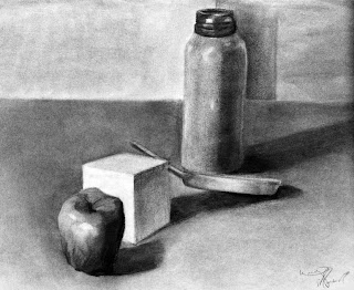
Honestly, i am considering requesting a different online teacher for this FND:110 class. She gave me a fucking "C" for the last homework i posted (not the immediate picture below, but the one i said i did).
Here is her reasoning as to what's wrong with my image and why it got a C.
= The cylinder's top ellipse looks good, except that its right end is a bit pinched.
= The bottom ellipse has a slightly pointed left end.
= The sphere and the cube have good structure. The cone, though, has pointed ends.
= There is also the sense that you're too close to the objects, because the cylinder and the cone are
leaning in the opposite directions.
= Normally, they should both be perpendicular to the table.
= The shading is started very well, but it isn't quite finished.
= The good thing about the shading is that the overall pattern
of light and dark shapes is very effective.
= What makes the shading look unfinished is mainly that most
of the objects don't have the full range of values.
= For example, the cylinder has about three.
= The sphere maybe four, and the cube only two or three.
= The cone has a greater range of values than the other objects,
but it's missing a lighter value.
= The cylinder's left side, and its top, should have more half-tones.
= The transition from light to dark on the cylinder should be more gradual.
= The sphere should have a visible highlight, and the lighter values
should get darker and darker as they get farther away from the highlight.
= Here, too, it would be good to have a softer transition from light to dark.
= The cube should have a couple more values.
= Parts of the darkest side of the cube should be darker.
= There should also be more difference in value between the two lighter sides.
= There is also the matter of outlines
= Right now, there are outlines around most of the objects, and around each of the cube's sides.
= In a finished drawing, ALL of the outlines should be done away with,
because they mess up the illusion of space (they remind the viewers
that what they're looking at is a 2D page, as opposed to 3D space,
since in 3D space, there are no lines).
= For example, the only way I should be able to tell where the
cylinder (A) ends and the table (B) begins is by a shift in tonal value.
= The line in between (blue) should not be there at all.
= The same applies to all the objects' edges, as well as the cast shadows' edges (light blue).
= Be careful about where you want to use the darkest dark that your material is capable of.
= It is usually better to use it sparingly, in small areas.
= This is because when you cover a large area with a very
dark, opaque layer of charcoal, it can attract a lot of attention and be distracting.
= Here, be careful about the dark value on the right side of the
cone (yellow), as well as the area of cast shadow immediately
to the right of the cube (white).
= It would be better to make them lighter, more transparent,
as opposed to opaque.
= Also when working with cast shadows, each cast shadow is
usually at its darkest immediately next to the object, and
gets lighter as it gets farther away.
= Its edges usually get softer with distance from the object.
= To create a better illusion of space, it is often better to make
the front edges of a cast shadow crisper than its back edges.
= For example, the front edge of the cylinder's cast shadow
(red) should be crisper and darker than its far edge (purple).
= Right now, it it the other way around, which can be distracting.
= The image as a whole would work better, and appear more finished,
with some more shading in the background.
= For example, it is usually a good idea to make the background
and the foreground different in value, because it helps create the illusion of space.


